Writing a Report
Create, fill out, and publish an inspection report from an order.
Overview
The inspection editor is where you document your findings and produce a client-facing report. You build the report from Sections and Items, rate each item, add comments and photos, then publish a web report (or PDF) that's emailed to your client.
For report-enabled accounts
Reports are built from your report templates, rating systems, and comment library.
Starting an Inspection
Open an Order and go to its Inspections tab, then click New Inspection. (You can also reach every report from the Inspections list in the sidebar.)
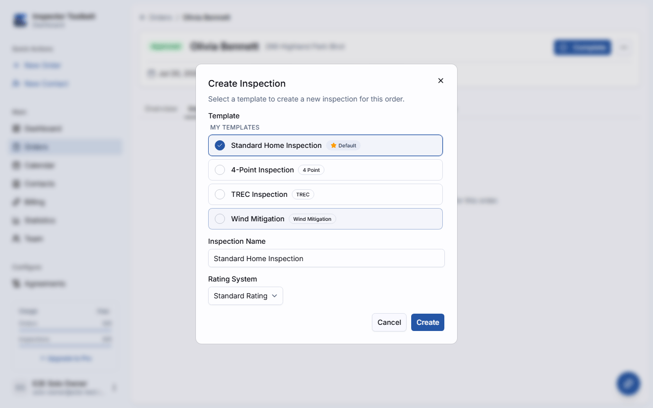
In the Create Inspection dialog, choose a Template, give the inspection a Name, and pick a Rating System. The template scaffolds all of the report's sections and items for you.
If you'd rather build the report yourself, pick Start from Scratch at the top of the template list. That creates an empty inspection with no sections or items — add them as you go with Add Section and Add item. Everything else works the same, and you can still choose a rating system.
On mobile
Tap Start Inspection on the order's card in Today and the template picker opens straight away — you don't have to open the order and find it yourself. Pick a template, then tap Start Inspection again to begin. If the order already has an inspection under way, the same button takes you back into it.
Filling Out the Report
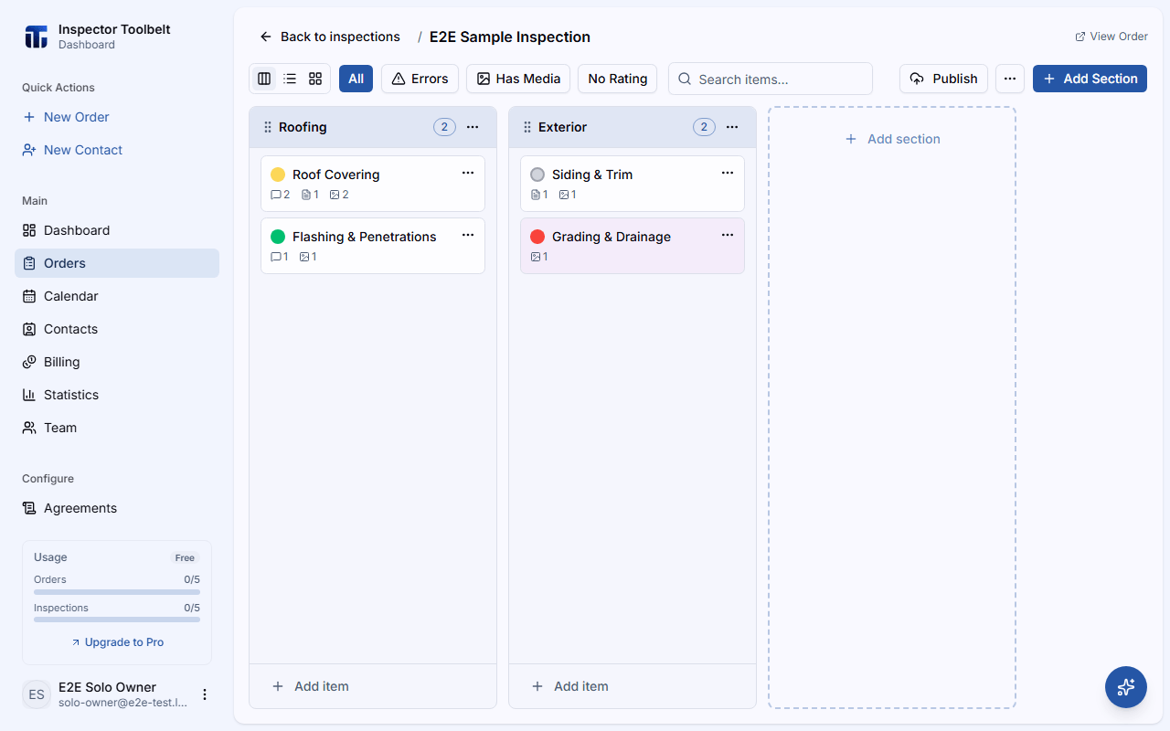
Work Through Items
Sections group your items. Click an item to open the item editor, which has Details, Comments, Attributes, Photos, and Sub-Items tabs. Drag a sub-item's grip handle to reorder the sub-items under their item; the published report follows that order. Use Add Section and Add item to extend the report beyond the template. Add Section is disabled while a search term or filter is active — clear it first. On a desktop-sized screen the item editor works the same non-blocking way it does in the template editor — the report behind it stays visible and clickable, and only the × button, Esc, or a footer button closes it.
Switch between Board and Tree layouts, and use Select to check off several items for a bulk delete — see Board and Tree Views for the full rundown, including the icons that flag a missing rating, a missing comment, or a photo still uploading.
Section list on mobile
On the ITB mobile app, opening an inspection lands you on its section list first — one row per section, each showing its item count and a lock icon when locked. A section that's hidden from the report shows greyed out with an eye-off icon, plus a Not in report badge once report numbering is turned on. Tap a row's ⋯ for that section's own tools — Rename Section, Move…, Lock Section (or Unlock Section), and Delete Section. Tap anywhere else on the row to open that section. Move… opens a full screen showing every section, with a highlighted copy of this one just below its current spot and the original greyed out. Press and hold the copy, then drag it up or down to where the section should go (hidden and locked sections can be moved too). Tap Move here to move it, or Cancel to leave it where it was. The section list then briefly highlights the moved row. Move… isn't offered while a section is still saving, or when there's only one section. With VoiceOver or TalkBack, the highlighted copy offers Move up and Move down instead of dragging.
The header carries the inspection's name, a search field for finding an item by name anywhere in the inspection (it shows matches as a tree grouped by section), the AI assistant button, and a ⋯ menu with Publish/Preview Report/Republish/View Report, Settings, and — if you own the inspection or are an account admin — Delete Inspection, which permanently removes the inspection and everything in it after a confirmation dialog. It's greyed out and reads Delete Inspection (offline) while you're offline, and disabled while a report is generating. A + button below the list adds a section.
Board view on mobile
Tapping a section pushes its board for in-place item editing — see "Moving between items on mobile" below. A floating bar at the bottom of the screen lets you scrub between sections: drag its knob, or tap a segment, to jump straight to one. It only appears once the inspection has 2 or more sections, and shows at most 12 segments at a time, sliding its window as you scrub past either edge. You can also just swipe the board sideways to move one section at a time.
Each item's card leads with a circle in its rating's color — an empty ring if it hasn't been rated yet, or the i information icon for an Information only item, which carries no rating. Search results lead with the same circle. There's no separate completion checkmark; the filled-in circle and the rating's name, printed as a caption under it, are how you tell an item is done. An amber warning icon appears on a card missing a required rating or comment. Below the name, small counts show how many comments, attributes, and photos the item has, and how many sub-items it has if they aren't already shown inline. When Show sub-items is on, a sub-item left out of the report carries its own Not in report badge once report numbering is turned on.
The board's own ⋯ menu leads with a pinned shortcut when one applies — by default Back to previous, which returns you to the last item, sub-item, or comment you had open in the inspection (tap it again to jump back the other way); change it from MorePreferences to Next unfinished (jumps to the next unaddressed item, which can cross into another section) or Off to remove it — plus the tools for the section you're on: Rename Section, Move… (the same full-screen move as on the section list; the board stays on the section afterwards), Lock Section/Unlock Section, then Delete Section, and a Show sub-items switch that expands every item's sub-items in place. Publishing, Settings, and deleting the whole inspection live on the section list's own menu instead (see above); the back button returns you there.
Tap the list icon in the header to open quick nav: a tall sheet listing the whole inspection, section by section, each expanding to its own items and sub-items. There's no search here, and no shortcut row (the shortcut lives in the board's ⋯ menu instead, above) — an item's rating shows as plain status text beside its name (or Not rated, if nothing's been set yet). Tap a section, item, or sub-item row to jump straight to it and close the sheet; to expand or collapse a section or an item's sub-items without leaving, tap the chevron at the start of its row (one section, and one item inside it, stays open at a time). The board doesn't change ratings — open an item to rate it. To reorder or move an item, use Move… in its card's ⋯ on the board (see below).
Moving between items on mobile
Tap an item card — on the board, in a search result, or from quick nav — to open it in place; the ITB mobile app never pushes a separate screen for it. The item's own name becomes the screen's title, with a compact row just below it reading its position (for example "Item 3 of 8") and its comment and photo counts on the right. The header keeps a back button and a ⋯ menu of that item's own actions (Rename Item, Move… (unless the section is locked, or the item is alone in a Inspection with one section), and Delete Item).
On the board (not in search or quick nav), every item card has its own ⋯ button at the end of its name. It offers the same actions as the item's own ⋯ menu: Rename Item, Move…, and Delete Item. A card opens with a tap; pressing and holding or dragging it does nothing. To reorder an item within its section, or move it to another section, use Move…; its sub-items move with it. With VoiceOver or TalkBack, a card also offers Move up and Move down. Moving is unavailable while the section is locked, and a locked item can't be renamed or deleted. On the board, sub-items have no ⋯ of their own; they move with their parent item. On the item's own screen each sub-item row does have one — see the Sub-Items card below.
Move… opens a full screen listing every section of the Inspection with its items. A highlighted copy of the item sits just below its current spot, and the original stays greyed out. Press and hold the copy, then drag it up or down — across section names too — to where the item should go. Or tap a section's name to send the copy to the end of that section. Tap Move here to move the item, or Cancel to leave it where it was. The item takes its sub-items, comments, photos, and attributes with it. The board then opens its new section with the card briefly highlighted (if you started from the item's own screen, it stays open in its new place). A locked section is greyed out with a lock icon and can't take the item. Moving to another section needs a connection: while you're offline, Move here stays unavailable for another section and says why, while moving within the item's own section still works.
Swipe the item content left or right to move to the next or previous item in the section — the floating bar at the bottom now scrubs the section's items instead of its sections. Swiping past the first or last item crosses into the last item of the previous section, or the first item of the next one.
Tapping a sub-item swaps it into the same place — its own name becomes the title, the row below reads "Sub-item 2 of 4" (its position among that same parent's other sub-items), its ⋯ menu now offers Rename Item and Delete Sub-Item, and the bottom bar scrubs the parent's other sub-items instead. The back button steps up to the parent item.
Opening a comment works the same way: its own name becomes the title, the row below reads "Comment 1 of 3," its ⋯ menu offers Rename, Save to Library (for a comment not already in your library), and Delete, the bottom bar scrubs the item's other comments, and the back button returns to the comment's own item (or sub-item). The list icon isn't in the header here — quick nav's tree stops at sub-items, so it has nothing to show for a comment.
From the board, an item, or a sub-item, opening quick nav and tapping a different item — or tapping a section's name to go to that section's board — jumps straight there, replacing whatever item or sub-item you had open.
The open item's Photos, Comments, Sub-Items, and Attributes cards each have a chevron in their header — tap it to collapse that card's list and free up screen space; the add button at the bottom of the card stays reachable either way, so adding the first photo, comment, or attribute is still one tap. Each card opens expanded the first time and remembers whether you left it collapsed on this device, separately for each kind of card.
Comments, Sub-Items, and Attributes cards each show a small count next to their title: Comments shows how many of the item's comments are included in the report (e.g. "2/10"), Sub-Items shows how many are rated (e.g. "3/5"), and Attributes shows how many have a value filled in (e.g. "3/5").
On the Sub-Items card, each sub-item is a row with a few controls:
- The checkbox at the start of the row sets whether the sub-item is included in the report — the same checkbox comment rows have. A sub-item that's left out dims the whole row. When report numbering is on, it also shows a Not in report badge and doesn't get a report number.
- The coloured dot is the sub-item's rating, and tapping it changes the rating: each tap moves to the next option in the rating system, and after the last option it clears the rating. The rating's name is printed under the sub-item's name, or No rating if it hasn't been rated. An information-only sub-item shows the i icon instead and has no rating.
- Tap the name to open the sub-item.
- The row's ⋯ menu offers Move up and Move down to reorder the sub-items within their parent (Move up is hidden on the first row and Move down on the last), then Convert to Comment, which turns the sub-item back into a regular comment on the item, and Delete Sub-Item. Pressing and holding a row doesn't open these actions.
Turn on report numbering to label each section, item, and comment with the number it will have in the published report — handy for referencing a specific finding when you talk to a client or agent.
Rate Each Item
Set a Rating for the item from your rating system.
Template defaults on mobile
If a template supplies a default rating, the mobile app selects it for you but doesn't count it as reviewed until you confirm it. On the item's Rating card, a note under the options says the rating is the template default — tap it to confirm. Tap any other option to set it yourself.
Items marked Information only don't need a rating — instead, their Details tab has a rich text content field (Information Content on the dashboard, Summary in the ITB mobile app) with its own formatting toolbar. Formatting carries over between the dashboard and the ITB mobile app.
Add Comments
On the Comments tab, click Add comment, then search your comment library or type a comment. You can edit inserted text for this report, including formatting like bold, italics, and lists — comments display with that formatting in the ITB mobile app too. Once the item has comments, the tab header shows a progress count (e.g., "2 of 5 on report").
To add a library comment without searching, type its shortcut — the short code saved on the comment, like RC — and press Enter or click Add. The code must match exactly, though capital letters don't matter. If the text isn't a saved shortcut, it's added as a new comment instead. To give a comment a shortcut, open it and fill in its Shortcut field, or set it in the comment library. The same codes work in the mobile app's Add Comment sheet.
While you type, a count above the results shows how many library comments match, for example 12 comments found. The list loads 20 at a time: click Show more at the end of the list, or scroll to its bottom, to load the next 20. While your library may hold more matches the count reads 20+ comments found, and it becomes an exact number once the whole library has been searched.
Each comment is a row with a checkbox at the start that sets whether the comment is in the report. A comment that's left out dims the whole row. When report numbering is on, it also shows a Not in report badge. Drag a row's grip handle to reorder the comments; the handle shows only when there are two or more.
At the end of each row are a few quick actions, from left to right: Convert to Sub-Item, an add-image icon, and Delete. Click the add-image icon to upload one or more photos straight to that comment without opening it; a spinner shows on the icon while the upload is in progress. Opening the comment still shows its own photo gallery as before. Comments on a sub-item don't have Convert to Sub-Item. See Sub-Items for what converting does.
Click a row to open the comment. Its name sits pinned at the top of the panel, and Save to Library, Convert to Sub-Item, and Delete stay pinned along the bottom, so they're always in reach however far you scroll through the comment's other fields. The actions at the bottom are hidden when the inspection is read-only. Changes save automatically when you leave a field, so there's no Save button.
Adding several library comments on mobile
In the mobile app, the Add Comment sheet uses one field for both jobs: type your own comment, or type three or more letters to search your comment library, or type a comment's exact shortcut and tap Add to insert it. Tapping a result adds it and leaves your search on screen, so the next match is one more tap — you don't have to search again for each comment. Tap the clear (✕) button in the field when you want to empty it and start over.
A count above the results shows how many comments match, for example 45 comments found. The sheet lists 20 at a time; tap Show more at the end of the list for the next 20, or keep typing to narrow the search. Before your phone has finished downloading your library, the count can read 20+ comments found until you reach the end.
The two ways of adding finish differently on purpose. Tapping Add at the top of the sheet adds what you typed and closes the sheet, because you're done with that comment. Tapping a library or Recently Used result adds it and keeps the sheet open, because you're usually picking several. Swipe the sheet down when you've finished picking.
AI Assist on mobile
In the mobile app, tap Generate with AI under the comment field and a draft comes back straight away — there's no form to fill in first. Anything short you've already typed steers it, so you can type "shingle, cupping" and tap. Once the field has text, an Edit this text row appears with Improve, Longer, Shorter, and Fix grammar. Review the suggestion, then Insert or Replace — nothing changes until you do.
The sliders icon beside the button opens AI settings: Defect narrative, Remediation action, and a choice of 1, 3, or 5 suggestions. Your choices are remembered on that phone, so you set them once rather than on every comment. See Using the AI Assistant.
Adding photos to a comment on mobile
On the item screen, a selected comment shows a small camera icon just before its ⋯ menu — tap it to take a photo for that comment. See Adding Photos to a Comment for the details, including what isn't available yet.
Edit a Comment (Mobile)
On mobile, tap an existing comment (anywhere except its checkbox) to open its detail screen: the comment text with the same AI Assist controls described above, then any attributes on the comment (the same attribute editor described below), location tags, a Photos card, the standards definition, a limitation toggle, and the comment's shortcut — the code you type to add this comment without searching. The comment's stored tags aren't shown on an inspection comment, but they still travel with it if you save it to your library. Formatting is kept, and changes save automatically as you edit — there is no separate Save button. Pressing and holding a comment opens its action menu.
The Photos card always shows, with the same Camera and From Library buttons as an item's Photos tab — see Adding Photos to a Comment.
Fill In Attributes
On the Attributes tab, enter a value for each attribute the template defines — a text field, a number, a Select or Multiple list of options, a date, or a slider for a Range. Drag an attribute's handle to reorder it. An attribute marked Required shows a red Required badge only while its value is empty — fill it in and the badge disappears.
On the dashboard, you can't click Done to close the item editor while a required attribute is still empty. On mobile, the item screen instead shows an Attributes required pill while any are empty — it doesn't block you from leaving the screen. Either way, you can still publish the report past the warning (see Previewing and Publishing).
On both the dashboard and mobile, ticking a comment that carries attributes shows them right under that comment in the Comments list, ready to fill in — you don't have to open the comment first. Unticking the comment hides them again (your answers are kept), and a comment with no attributes shows nothing extra. Only the values can be filled in there: adding, renaming, deleting, or reordering a comment's attributes still happens when you open the comment.
If you change an attribute's type or its options after a value was already selected, any selected option that's no longer in the list is cleared automatically.
Some attributes are locked: you can still fill in their value, but you can't rename them, change their type or options, or delete them. If the item itself is locked, Add Attribute is hidden and reordering is turned off for its attributes.
Editing attribute definitions on mobile
On the ITB mobile app, each attribute row's overflow menu has Edit attribute, Move up, Move down, and Delete attribute — editing an existing attribute's name, type, options, unit, or Required setting is no longer web-only. A Range attribute is set with a slider instead of a text field. Adding new attributes to a template, so every future report starts with them, stays web-only — do that in the template editor.
Attach Photos
On the Photos tab, click Upload or drag files in. You can annotate a photo and Set as cover for the report's cover image.
Your work is saved automatically
Inspections auto-save as a Draft. Only you can see a draft — it isn't shared until you publish.
Previewing and Publishing
Click Publish to open the Publish Report checklist. It flags anything worth reviewing first — a missing cover image, items missing a required rating, comment, or attribute value, or photos that haven't finished uploading. You can override the warnings and publish anyway.
On mobile, a missing cover photo row in the checklist has its own Add button (camera icon) to take a cover photo, and a photo-library icon button next to it to pick one, so you can add one right there without leaving the checklist to open Settings.
From the checklist, you can also choose which Report Published automation sends and attach documents to the report.
Preview
Use Preview to generate a temporary version of the report without emailing anyone.
Choose Recipients and Publish
Select who receives the report — Client, Buyer's Agent, Listing Agent, or Other — then click Publish. The report is generated and emailed to the selected recipients, and View Report opens the live web report.
PDF-only reports
Most reports generate an interactive web report. Wind Mitigation and 4-Point inspections generate a PDF instead, and for those View Report opens the PDF directly — on the dashboard and in the mobile app alike.
The Repair list setting in Preferences does not add a PDF to what you publish. It puts a Create Repair List button in the web report your client opens, and the client builds the list themselves. The button only appears once the report has findings that need attention.
After Publishing
If you edit a published report, click Republish to regenerate it. Publishing doesn't change the Order status, but it fires the Report Published automation trigger — so you can automatically send a follow-up or payment reminder. From the editor's overflow menu you can also Save as Template to reuse this report's structure.
If a republish fails, the Report stays marked Published. The copy your client already has is still there and still opens — only the newest changes didn't make it in. A small warning triangle sits next to the badge, labelled Last publish attempt failed. Fix what caused it, then republish. A Report that has never published shows Failed instead. In the Inspection editor, a failed publish turns the toolbar button red with a warning triangle. If the Report was never published, the button still reads Publish. If it was published before, the button changes from View Report to a red Republish, and View Report moves to the ⋯ menu. Click the red button to open the checklist and try again.
In the ITB mobile app, both actions sit behind the ⋯ button on the inspection screen: View Report reopens the published report, and Republish regenerates it. They're there for PDF-only reports too. If you're offline, Republish stays in the menu but is greyed out and reads Republish (offline) — publishing needs a connection, along with everything else in the "Needs a connection" column of How Offline Sync Works.